Janusz Golik. The Line of My Horizon.
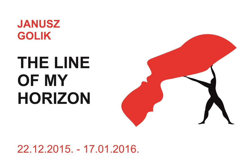
Janusz Golik.
The Line of My Horizon.
Line, Colour, Symbol in the golik’s Graphic Work.
In Janusz Golik’s “right place” exhibition, the pages of graphics at first glance could have seemed like posters. Clearly defined signs or symbols, on a just as poster-like smooth surface in stop-signal red or black colour, are set out at the centre of the composition planes. A strictly limited colour palette (red, black, white) and poster-like laconic expression of form lead to associations with the declarative assertiveness of the commercial advertising and logotype world. Although, for example, let’s recall this same colour code and ascetism of form in the Suprematism of Kazimir Malevich and his contemporaries, or in Lissitzky’s famous poster Бей белых клином красным!. In the 1920s, such rev-express ion also meant belonging to the Left and opposition to the entirely despised bourgeois culture. However, in Golik’s graphics political motivation cannot be found in such an open way. This is manifestly artistic – his personal colour minimalism in the name of expressive maximalism. If we cling closely to academic, traditional views, it is only the lack of text or slogans that allows the pages of graphics he offers to be perceived as “great art”. And precisely this, here, would be completely misplaced.
Erroneously held under suspicion of being Leftist, van Goliks should be completely exonerated, if we begin to examine the formal shapes of his drawings, where we almost have to agree with the old Bolshevik pure-minded view – this one really has drawn on and erupted from decadence. In the lines of Golik’s poster-like figures one can rather sense the suppleness and sensuality, in places even the perversity, of Aubrey Beardsley. This is motivated by the emphatically erotic subject matter of the sketches. The passion saturated with drama does, however,get as if intelligently ornamental- ized. In almost every graphic work, a pictogram-like entanglement of two figures is portrayed with barely hidden accents and allusions to the beautitful presence of genitalia.
Golik’s eroticism, even with all of his perfection of lines, is far from that which we find in the world of, say, Botticelli, Ingres, Klimt or Mucha. There, everything was based on the sensitivity of the “living hand” and was decked with a lining of academic skill. Golik’s lines, on the other hand, are designed as in a draftsman’s drawing, in the direct sense, almost like they were extracted with the help of a template. And even their existence is largely reduced to the outlines of silhouettes. One can observe a similar passionless “draftsmanlike” treatment, for example, in the graphics of a number of Estonian classics (Leonhard Lapin, Tenis Vint and others). You could say that it’s a kind of feature of the technocratic age. But this is not the place for regrets about the past, and one doesn’t have to search for exculpatory words. It’s another aesthetic, where passionate feelings inhabit a cool flow of lines – like in the body of an aeroplane, toaster or refrigerator. Cool – that’s the slogan of the age!
Janusz Golik’s poster-like graphic compositional solution is always simple, clear and laconic as a road sign. To be absorbed like a blow to the head. The possible condition of shock is alleviated by a therapy of muted humour and plaster. If our overwrought sensors are still able to perceive them. At times something “revolutionary” flashes in the interpretative pathos and ballet-like poses of his humanoid figures – like in Delacroix’s La Liberte guidant le peuple. A generalization in a symbol is Golik’s graphic language which he, supposedly, has used in the realm of poster art. What has been cultivated there and recognized as good is continued in his graphics pages. An exact and concise symbol replaces the “weeds” of volubility of the literary message. When looking at his people-signs, one thinks also of our graphics and poster grand master and philosopher in art, Ilmars Blumbergs, whose “trade mark” and constantly repeated motif is the “embryo-person” – a humanoid interpreted in the silhouette image of a Turkish bean or kidney. There isn’t any doubt that both artists, Golik and Blumbergs, have during their study years “fed” from the one cultural bowl – Made in Poland. One directly, the other – at a distance and indirectly.
Janis Borg. An abstract from the essay “Janusz Golik. To Be in the Right Place”.